Skype 5 for Mac: A Huge Step Backward
A while back, when Skype’s group video chat feature was still free, a friend of mine sent me a Skype message asking whether it was possible to do video chat with more than one person in Skype. “Sure,” I replied, “you can do that, but you need to install the new Skype 5 beta.” I sent her the link. A few minutes later, she went offline, and came back shortly thereafter, apparently having updated to Skype 5. The first message she sent was:
What the hell happened to Skype? Is this some kind of joke?
Apparently, it is not.
At work, we use Skype to communicate. A lot of the people here use Windows computers. More than once, a Windows user has walked by my Mac, seen my version of Skype, and said something to the effect of “Wow, this looks so much better than the horrible mess we have on Windows!” It seems Skype has noticed that there is a discrepancy in quality between the two versions, and has decided to make the two versions more similar. Unfortunately, instead of making the Windows version of Skype better, they’ve decided to fix the discrepancy by making the Mac version of Skype more like the Windows version.
Now, I have to point out that Skype undoubtedly has constraints I do not know about. Maybe Skype had to do this. Maybe there was some serious problem with the previous version of Skype. When Twitter initially added the quick bar to its iOS client, they didn’t do it because they wanted to mess with their users; they did it because they had to find a way to make money. Similarly, Skype probably has good reasons for why Skype 5 looks the way it does.
Having said that, I really don’t like Skype 5. [Editor’s note: And neither do we at TidBITS, which is why we’re republishing Lukas’s article. We were planning to write something very much along these lines, but he did such a good job that we didn’t see any reason to pile on independently. -Adam]
The previous version of Skype was a very good piece of user interface design. In its initial state, it was extremely basic. This is what Skype used to look like:

It had a simple window showing a search field, a counter for unread notifications, and a list of your friends, with the ones who were currently online at the top. It was easy to understand, didn’t take much space so I could always keep it visible, and it showed me all the information I needed to know. Who’s online? Did I miss something? Is it okay to contact a friend, or does he not want to be disturbed?
With an active chat, Skype used to look like this:
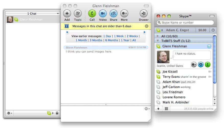
Again, simple and easy to understand, but still giving me everything I might need. I could add more people to the conversation, go back to earlier messages, or call people.
But the previous version of Skype wasn’t just simple; it was also flexible enough for advanced users. At work, my Skype needs are quite different from most people’s. I talk with eight people all the time. I often refer back to earlier conversations. I often chat with more than one person at the same time. To make all of this as efficient as possible, I’ve dedicated a full virtual desktop to Skype. Here’s what it looks like:

Merely by switching to this virtual desktop in Spaces, I can immediately contact the most important people, and at a single glance, I can see who has written to me, and what they have written (which is important: to avoid being constantly interrupted, I sometimes turn off notifications while I’m working).
This is a far cry from how most people use Skype, but my point is that Skype used to support both kinds of users. If you were a casual user, Skype was simple and easy to understand. If you had more demanding needs, Skype could grow with your needs.
Let’s fast-forward to Skype 5. This is what it looks like:

The sidebar on the left has a Contacts item and then a list of your chats. Clicking Contacts shows all your contacts in the main pane; clicking a past chat shows information about the chat (start and end time, and any text messages that went back and forth). Clicking a live chat shows the participants and any text or video associated with the chat.
Immediately, there are problems with this. And not just problems for advanced users, but also problems for casual users.
It’s Too Complicated for Casual Users — The window no longer looks simple. Instead, it’s overwhelming. On the plus side, it’s now easier to add a new contact (not something you do that often), and I can decide whether to call somebody or start a chat by hovering over a contact.
On the minus side… everything else. Since every Skype feature is crammed into a single window, that window feels overloaded. No longer do I see a simple list of contacts. Instead, I have a complex multi-paned window whose main pane shows entirely different things, depending on the application’s mode.
No longer can I easily see who’s online. Instead, I probably see only the people I’ve talked to most recently, regardless of whether they’re online. More than once, I’ve waited for a friend to show up in the sidebar, expecting it to work like the old buddy list. It doesn’t. Unless you switch to the Contacts screen, which then causes Skype to show two lists of contacts next to each other (the past chat contacts in the sidebar and the Address Book contacts in the main pane), you don’t actually see who’s online. And those two lists behave entirely differently.
There’s too much extraneous stuff in the main window. For example, right next to the important Add Contact button, there’s a button that allows you to see the pictures of the people in your address book in a Cover Flow view. What is this good for? Why would anyone ever want to do that? Making this view even more useless are both the inscrutable avatar pictures many people use and the generic icons Skype inserts for those who lack pictures.

Something I’ve noticed even casual Skype users do is to send URLs by text chat during a video chat. How do you do that in Skype 5? If a video call is active, it occupies the main pane, which is also where the text chat would be; so you can’t do both at the same time. Actually, there is a way, but it’s not obvious. During an active call, if you move your mouse over the main pane (but not the sidebar), you’ll see a bunch of tiny icons pop up at the bottom.
![]()
Clicking the second one splits the window horizontally, and adds a chat view below the call view. Which, on a modern screen with a wide aspect ratio, is usually not where you want it. So the feature is hidden, and poorly implemented, but at least Skype allows you to type chat messages during a call if you can figure out how.
Also troublesome is how Skype changed group calls. Before, you saw a list of people, one per line, with green equalizer-like lights that lit up when that person was talking. It was great for conference calls where you didn’t know each person’s voice, and it wasn’t distracting or obtrusive. Skype 5, in contrast, shows the avatars of two people enlarged in the upper part of the main pane, and then a horizontal list of the avatars of the rest of the people below. When someone is speaking, Skype moves that person’s avatar into one or the other of the top two spots, and pulses a gray outline in sync with the audio. The constant shuffling of avatars is distracting at best, and annoying at worst.
It’s Not Flexible Enough for Advanced Users — Skype 5 isn’t just harder to use for casual users, it’s also less flexible for advanced users. Earlier versions of Skype were simple to understand and easy to use, but they allowed users to grow. As users learned more, they were able to make use of Skype’s advanced features. Skype 5, on the other hand, is a shallow app that doesn’t give its users room to grow.
With Skype 5, I can’t see two chats at the same time. At first, I thought that I must be missing something. Surely, chatting with two people at the same time is a common use case. I can’t be the only person who does that, can I? Skype seems to think I am. There’s no way to see two or more chats next to each other.
The default window is too large, and it can’t be made small without destroying functionality. I like to keep Skype running all the time. The older version’s window was small enough that I could fit it at the edge of the screen; if I need to know if somebody is online, I can see that at a glance. Skype 5’s window is way too big. Even if I don’t hide the app intentionally, it eventually gets covered by other windows.
I can’t see who’s online when a chat is active, unless I open a second window with a list of users. Now I’m duplicating functionality across two windows; I end up with three different user lists in two different windows that all behave in slightly different ways. I guess it’s good to have the option, but why replace something that works perfectly well with something that doesn’t work particularly well, and then, to cover the fact that the new version of your feature doesn’t work well, also re-introduce the earlier version?
Public Response — When Skype launched the new user interface, response from users was overwhelmingly negative. Now, new software versions always get negative responses. People don’t like change, even if it’s for the better. But I can’t remember any other case where people responded negatively to a new software release in such numbers and with such consistency.
Maybe Skype made the Mac version look more like the Windows version because a lot of people use both; if the two look the same, users only have to learn how to use Skype once, and can then apply their knowledge to both platform versions. However, I don’t buy that explanation. The two versions look more similar, but they still behave differently. As a result, making them look similar is actually confusing, since it creates the expectation that they will behave the same when they don’t.
Skype is a tool used both by casual users and by experienced users who use it every day in a professional context. It’s incredibly hard to get this kind of user interface right. The old version did an admirable, elegant job serving both audiences. The new version, unfortunately, is a huge step backwards.
I have to repeat what I wrote earlier: Skype undoubtedly has constraints I do not know about. I’m sure there are good reasons Skype 5 works the way it does. Maybe Skype even plans to fix the issues I mentioned, but simply hasn’t gotten around to it yet (in fact, Skype 5.1 did a bit of that, bringing back active speaker focus, which had been lost entirely in the 5.0 release). Unfortunately, none of this makes Skype 5 work better for me. On the plus side, Skype 2.8 still works — at least for the time being — and you can still download it, if you need to downgrade from Skype 5.
Although I’m certainly not in a position to change Skype’s interface, I did want to offer some constructive suggestions; see “Skype 5 Ideas” on my blog, and check out Matthias Kampitsch’s design suggestions as well. Also, although it doesn’t address Skype 5’s overall interface, Skype is having a competition for how text chats are displayed in the application and has promised larger changes as well.
[Lukas Mathis studied Computer Science/Software Engineering and Ergonomics/Usability at ETH Zürich and works as a software engineer and user interface designer for a Swiss software company creating workflow management software. His first computer was a Performa 450, his first programming language was HyperTalk, his first electric guitar was a cheap Peavey, his first video game was a VCS 2600 and his current snowboard is from Lib Tech. He lives in a small cottage in a remote part of the Swiss Alps. You can follow him on Twitter.]
I totally agree with your article. I really hate version 5 and am sorely tempted to switch to Oovo instead. But you can just bring up an online contact window by doing a Command 3 and then closing out the main window. At least that gets it out of the way when you have no conversations going on.
Yeah, I mention this in the "advanced users" section. Like you say, it doesn't really solve any problems, it just adds additional clutter, because you still need the main window as well.
Oovoo looks interesting!
I have a friend who uses it to talk to his family in MN. They tried Skype and just could not maintain a reliable connection. They tried Oovo and it seems to work just fine with no dropouts. So at least in this case it seems to work better with marginal connections.
However, the Contacts Monitor window floats above all other applications' windows, which is not necessarily a desired approach. I personally arrange windows on my monitors carefully so they're in expected positions, but I don't want anything floating on top at all times.
I've just launched a site at ihateskype5.com Please visit it and sign the petition to get them to fix Skype.
The negative comments started long before Skype 5 was released. Skype 5 was available as a beta for months, and the negative comments started on the very first day. As for Lukas' comment that Skype "must have had a reason," there are only 2 reasons I can think of. Either Windows-centric developers just arbitrarily decided that Mac users wold really like a Windows user experience or, my preferred reason, the entire Skype design department had a mass lobotomy.
I agree. Usually I'm too modest to vent off like this. But the UI of Skype 5 is simply unacceptable. And unworthy of the Mac.
I'm a very casual skype user. The interface is fine by me. Sure, it could use improvements. But it shouldn't be frozen where it was. 2¢
Carry-on
One other non-UI issue with Skype 5.0 I have experienced in calls with a friend is that Skype 5 often freezes the video transmission after 10 or 20 or 30 seconds (at least in our setup).
I have posted to their support forum, issue seems to be pretty well known there.
We are hoping that the new v5.1 fixes that (yet to be tested).
P.S. this was to be a general comment on the article topic itself, not intended to be a reply to user comment. sorry.
Also experiencing video freezes on my end under v5. Sometimes my window is not visible to a caller when answering.
v5.1 doesn't fix the freeze issue
Having been part of Microsoft focus groups, I suspet some of the blame may rest on the fact that, unless carefully managed, such groups tend to be dominated by shallow loudmouths whose tastes in a UI is awful and who like change for the sake of change. Knowingly or unknowingly, Skype may be imitating Microsoft with similar results.
i am using skype on windows. any versions of skype after version 3.8 has been a calamity, with gradually missing features and rapidly bloating interface. i have since downgraded mine to version 4 and is seriously contemplating going back to the practicality, simplicity and usability of version 3.8.
never have i seen a popular applications screwed itself up so much in my more than 20 years of computer usage. let alone one that was having a clearly promising development roadmap to begin with.
I made the mistake to install Skype 5 too. What a mess. Glad I found an older version (pre 5) online and I've switched back and loving it. Glad to read your article and know it is not just me who's had issues with he latest version.
Must have been a management change. No programmer at Skype could have made such a mess of an existing MAC interface. Did Skype really believe it would be acceptable to go from a simple streamlined interface and drop Windows crap on us?
Actually I think Skype 5 is a huge improvement over the older version. I could never figure out how it worked. Finding call history was near impossible and I never figured out how to start a chat.
Now I can see everything infront of me. Well done to Skype I say. A move in the right direction as far as I'm concerned.
Wow, I'm just so glad you put a link to download 2.8! I'm busy downloading it now, the funny thing is it says on the download page "Improve your Skype experience with this version of Skype for Mac"... ain't that just the truth!
Skype 5 not only sucked big time, it wasn't even stable. Crashed about 2/3 of the time. Which I guess was a blessing in disguise, because it was what prompted me to trash it and go back to 2.8.
I installed Skype 5. The Skype window took up so much of my monitor real estate I went back to v.2.8 right away. At that point I went the rounds with Skype support (who were very responsive, BTW). I was told several times to simply "grab the lower right corner of the window" to resize it. That, of course, did nothing to reduce the window size and give me back my screen for other mote visual tasks. Guess I'll stay at v.2.8 until it stops working then I'll move away from Skype.
Sadly (for Skype), I agree whole-heartedly with Luke. I'm a mid-range user - bit more than casual, not quite a pro. It used to be much easier to access the different Skype windows using the Command~ keyboard shortcut while in the application. Having to mouse-over to have (tiny) icons appear in a window to activate such things as the text chat field is really a pain.
I also completely agree and have posted similar notes to Skype's official blog. Everybody agrees and nobody can fathom why they did what they did with Skype 5.
If you want to see a nice Skype black window, even with the new 5 version, just go to the Skype top bar and select "Window", then "Contact monitor".
You can then lower the big white window and keep only the slim black window.
Have fun!
But people should keep in mind that the Contacts Monitor window floats above all other windows at all times, which may not be desirable.
Skype 5 on Mac no longer allows you to select a portion of your screen to share. It's entire screen or none. Previously in 2.8, one could create a selection and share it.
I now rely on TeamViewer for most functionality. It is faster as well, allows sharing screens with multiple users via a web browser, and allows one to control a remote user's computer. Great for tech support and troubleshooting my parents' computers. It only lacks a voice feature, but for that a phone line is sufficient.
http://www.teamviewer.com/en/index.aspx
Yes, we just noticed the lack of selection-based screen sharing here too. A shame, since that was a nice way to share a portion of a very large two-monitor desktop.
We've also been using http://join.me for very quick ad hoc screen sharing.
I have SkypeIn numbers in Australia and UK for my family to call me. Since Skype 5, it's impossible to determine which calls I've missed and Call Forwarding no longer works, even after I tweaked the preferences in accordance with instructions from Skype to make Call Forwarding work for the Mac. The interface I don't mind, except the disappearance of the Instant Message window once a call starts.
Thank you for posting this. I read more than 200 plus comments on the Skype for Mac site after downloading Skype 5, after being highly annoyed by the overblown and confusing UI offered up in Skype 5. My assumption was Mac version 5 was redesigned closer to iPad, iPod or iPhone apps format. Skype apps are simple and work fine within fairly large limitations. Unfortunately, someone appears to have forgotten about monitor real estate when using a laptop or cpu. Not only did I downgrade to the older version, I am actively seeking a different provider. This may be the only signal Skype understands before they take action to correct their latest Mac computer dysfunction as opposed to their new Mac apps. My guess is they assume we use post-computer gadgets more of the time.
I couldn't agree more. The buzz on Skype 5 was so bad I avoided every prompt to upgrade until, bingo, about two weeks ago my installation of Skype auto-upgraded itself and I was stuck with it.
I hate to say it, but Skype 5 is the "Windows Vista" of Skype. They can't get to Skype 6 fast enough.
Remember that you can downgrade to 2.8 (link at the end of the article).
I hated the old Version! and I'm sure Skype got lots of complaints about the look of the old one. I personally have Skype 5 running all the time on my mac and love it whereas with the old one I only ran it when I knew someone was going to skype me - I hated all the separate windows and the clunky look. The new one is much easier to use and still has all the little windows for contacts and dialler if you really want to clutter up your screen. I like that with the new one I can see all my chats and calls in one place and it works like any other mac app now. I also love it that my chats sync across my iphone and android phones don't forget we're getting all this for free.
Still a great program. The only problem I had was downloading right before a conference call and took me some time to get the new interface working quickly and comfortably. I do agree, it is not a better update.
5 is a disaster. So glad to see this article and totally agree. In fact I agree more.
What used to be a quick easy application to use has become almost unfathomable - and stealing quadruple the screen real estate for less functionality.
…Even more that there's been enough time and no sign of things changing for the better. Wake up Skype, you put the wrong UI team on this one.
I used to love hopping over to Skype - now I just groan and try to figure out how to do what I need to do.
-sob-
I, too, thank you for the link back to version 2.8. I've been stumbling through the 5.0 interface and was ready to drop Skype altogether, even though at $3 per month for dial-oup and $36/year for a dial in number with voice mail is financial a great deal. Now I'm back with the basic, and compact, interface and better access to key functions.
From the article: "Now, I have to point out that Skype undoubtedly has constraints I do not know about. Maybe Skype had to do this."
Skype employed a consultancy, 8020.com, to do the design and some of their comments are illuminating:
OVERVIEW: Skype’s Mac application was [showing] its age as it packed in an ever-growing number of features. … Skype saw the need to consolidate its product development efforts and drive user experience consistency across platforms. …
SOLUTION: … testing … of the Mac client highlighted issues with window [and] contact management and revealed that features didn’t have enough real estate to be articulated effectively. The new single-window … improves work flows between calling and messaging …
RESULT: The next-generation user experience … increases use of core features while providing a clean slate for growth. The success … is seen … in the Mac client [and] in the design’s ability scale to touch-screen devices …
Oh well, I'm backward, I reverted to 2.8!
Boy, if I were responsible for Skype 5's interface at this point, I wouldn't be trumpeting my role in its design. :-)
Does that sound like a consultant trying to justify their fee or what!
As was demonstrated in the article (and by many of those posting here), the new design certainly does NOT improve workflows between calling and messaging.
I am a non-sophisticated user. I hate the new Skype It still has a klugey way to go to video! That is only one of the really goofy ways.that they did stuff. Also when I had problems and needed direction with the use of this thing all I got was canned answers that were non responsive. If everyone could use i-chat (MAC) there would be no Skype 5!
I am a non -sophisticated user of Skype but a pretty sophisticated user of both Windows and MAC platforms. I HATE Skype 5. It took me forever to get the thing up and running. Any problems that I had would be answered with a non-responsive canned message. The thing freezes as did previous iterations (2) that I have used. We travel often out of the country and use it to contact business and other people while we are away. I hate paying for something that used to be free (conference chats) Support should be more sophisticated and responsive and Skype should go back to a simple user interface.
Give back our old Skype!
My main gripe (currently) is that you can now only share the whole screen, not just part of it. So, if you're explaining something by example to someone, and they go to full screen to be able to see what you're talking about... they lose sight of their own screen! Usually, you really only want/need to share a window, not the whole screen.
Why Skype removed that very useful feature is beyond me.
I so totally agree that Skype 5 is really bad — for all the reasons you list. I regretted installing it the moment I first opened it up.